Corel Painter Help :
Color : Working with color harmonies
Quick links to procedures on this page:
Corel Painter lets you create a color harmony, a set of colors that work well together aesthetically. The resulting color scheme contains a set of colors that are created based on the chosen mode, and its base color is the Main Color in the Color panel.
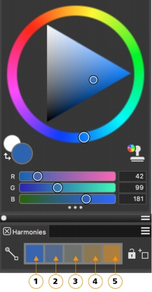
Warm and cold colors are created for vibrant and energetic color schemes. From left to right, the five color swatches of the Complementary harmony are: Main color (1) and its direct complementary color (5); (2), (3), and (4) are a blend of the two complementary colors.
Once you create a color harmony, you may choose to lock it to prevent changes to the colors. When a harmony is not locked, the colors in the color harmony are linked to the Main Color in the color wheel. Changing the Main Color dynamically updates the swatches in the color harmony, and vice versa, clicking a color harmony swatch updates the Main Color in the color wheel. When you lock a harmony, selecting a new Main Color in the color wheel does not affect the color harmony colors, however, clicking a color harmony swatch still updates the Main Color in the color wheel. When you unlock a color harmony, it is updated immediately based on the Main Color in the color wheel.
You can save a color harmony for future use. Color harmonies are saved as color sets and appear in the Color Set Libraries panel (Window  Color Panels Color Sets).
|
• |
Double-click the Main Color or Additional Color swatches in the Color panel to display the floating color selector, and choose a color in the context of your painting. |

If you select a swatch in the color harmony, the harmony is updated using that swatch as the base color.
| • |
Click the Lock button  next to the color harmony. next to the color harmony. |
| • |
In the Harmonies panel, click the Color options button  , and choose a color harmony option: , and choose a color harmony option: |
|
• |
Analogous Harmony  — includes colors that are next to each other on the color wheel, creating clear and smooth color schemes. The Main Color is the middle of five swatches. — includes colors that are next to each other on the color wheel, creating clear and smooth color schemes. The Main Color is the middle of five swatches. |
|
• |
Complementary Harmony  — balances the Main Color with the opposite color on the color wheel. Warm and cold colors are created for vibrant and energetic color schemes. From left to right, the five color swatches are: Main color (1) and its direct complementary color (5); (2), (3), and (4) are a blend of the two complementary colors. — balances the Main Color with the opposite color on the color wheel. Warm and cold colors are created for vibrant and energetic color schemes. From left to right, the five color swatches are: Main color (1) and its direct complementary color (5); (2), (3), and (4) are a blend of the two complementary colors. |
|
• |
Split Complementary Harmony  — balances the Main Color with colors that are situated close to the opposite end of the color wheel, forming a triangle. This harmony rule usually creates color schemes of soft contrast. The Main Color is the leftmost of three swatches. — balances the Main Color with colors that are situated close to the opposite end of the color wheel, forming a triangle. This harmony rule usually creates color schemes of soft contrast. The Main Color is the leftmost of three swatches. |
|
• |
Tetradic Harmony  — based on a pair of colors and their complements on the color wheel. This rule usually creates bold color harmonies and requires careful planning when used. The Main Color is the leftmost of four swatches. — based on a pair of colors and their complements on the color wheel. This rule usually creates bold color harmonies and requires careful planning when used. The Main Color is the leftmost of four swatches. |
|
• |
Monochromatic Light Harmony  — creates smooth color schemes that include five colors: the Main Color, which is the leftmost color, and four variations that increase in lightness in increments of 10% — creates smooth color schemes that include five colors: the Main Color, which is the leftmost color, and four variations that increase in lightness in increments of 10% |
|
• |
Monochromatic Dark Harmony  — creates smooth color schemes that include five colors: the Main Color, which is the leftmost color, and four variations that increase in darkness in increments of 10% — creates smooth color schemes that include five colors: the Main Color, which is the leftmost color, and four variations that increase in darkness in increments of 10% |
| 1 . |
In the Harmonies panel, click the Add Swatches to Color Set button  next to the color harmony. next to the color harmony. |
| 2 . |
In the New Library dialog box, type a name in the Save As box, and click OK. |
| • |
Click Window Color Panels Harmonies. |