This section provides answers to some commonly asked questions about color management.
What is color management?
Color management is a process that lets you predict and control color reproduction, regardless of the source or destination of the image. For example, a monitor displays a different set of colors than a printer reproduces, so you may see colors on-screen that cannot be printed. If you want to reduce color discrepancies, you can use color management to ensure a more accurate color representation when an image is viewed, modified, or printed.
During the digital imaging process, different tools are used to capture, modify, and print images. In a typical workflow, you capture an image by using a digital camera, upload the image to a computer, modify the image in a photo-editing application, and print the image. Each of these tools has a different way of interpreting color. In addition, each has its own range of available colors, called a color space, which is a set of numbers that define how each color is represented. A color space is a subset of a color model (for example, CMYK or RGB). In other words, each tool speaks a unique language when it comes to color. One number in the color space of a digital camera may represent an entirely different color in the color space of a monitor. As a result, when an image moves through the workflow, the colors get lost in the translation and are not accurately reproduced. A color management system is designed to improve the communication of color in the workflow.
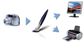
This is an example of a typical digital imaging workflow.
A color management system, also known as a color engine, uses color profiles to translate the color values from the source, which ensures a more accurate color reproduction at the destination. A color profile contains the data that the color management system requires to translate colors. Many standard color profiles are available. In addition, color profiles exist for different brands of monitors, scanners, digital cameras, and printers.
Why do I need color management?
If your document requires accurate color representation, you should consider using color management. The complexity of your workflow and the ultimate destination of the images are also important considerations. If your documents are destined only for online viewing, color management may not be as important. However, if you plan to open images in another application, such as Adobe Photoshop, or if you are creating images for print or multiple types of output, the use of color management is essential.
Color management lets you do the following:
A color management system does not offer identical color matching (this is not technically possible), but it greatly improves the color representation.
Is my monitor displaying the right colors?
How you perceive the color that your monitor displays is another important factor in managing color consistency. Your perception is influenced by the environment in which you are viewing the images. Here are some ways to neutralize your viewing environment.
Calibration and profiling of the monitor, also known as characterization, are also important steps for ensuring color accuracy. Calibration helps ensure consistency in the colors that are displayed on the monitor. After calibration, you can create a color profile of the monitor, which contains the details of how the monitor interprets colors. The profile is then shared with other devices. Calibration and profiling work together to achieve color accuracy: If a monitor is incorrectly calibrated, its color profile is not useful.
However, calibration and profiling are complex and usually require a special calibration device and specialized software. Furthermore, improper calibration may do more harm than good. You can find additional information about monitor calibration and custom color profiles by researching color-management techniques and products. You can also refer to the documentation that was provided with your operating system or monitor.
Should I assign or convert color profiles?
In deciding whether to assign or convert a color profile, you should first consider the results that each action produces. When you assign a color profile in Corel Painter, the color values, or numbers, in the document do not change. Instead, the application simply uses the color profile to interpret the colors in an image. However, when you convert a color profile, the color values in the document change. Instead of assigning a color profile, the application translates one color profile to another. Converting a color profile does more than affect the display of colors — it produces irreversible changes to the colors in the document.
The best practice is to choose a working color space, such as sRGB, when you create an image and to use the same color profile throughout your workflow. You should avoid assigning and converting color profiles. However, you may encounter scenarios that require you to switch to a different color profile.
For example, if you receive a file from someone, and no color profile is embedded in the file, you should assign a color profile to the file. In this way, you can retain the file’s original color values.
You should choose the conversion option only if you are preparing the file for a specific output, such as a printer. After the data has been changed to accommodate the destination profile, conversion back to the original color profile is often not suitable.
What is a rendering intent?
A color management system can perform effective translation of colors from the source to multiple outputs. However, when matching colors from one color space to another, a color management system may be unable to match certain colors. These "out-of-gamut" colors can dramatically change the look of the image, depending on how they are interpreted by the color management system. Fortunately, you can choose a rendering intent to instruct the color management system how to interpret the out-of-gamut colors. The rendering intent that you choose depends on the graphical content of the image.
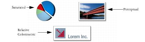
This is an example of three types of images and their corresponding rendering intents.
| • |
Perceptual — Choose this rendering intent for photographs and bitmaps that contain many out-of-gamut colors. The overall color appearance is preserved by changing all colors, including in-gamut colors, to fit within the destinations range of colors at the destination. This rendering intent maintains the relationships between colors to produce the best results. |
| • |
Saturated — Choose this rendering intent to produce more concentrated solid colors in business graphics, such as charts and graphs. Colors may be less accurate than those produced by other rendering intents. |
| • |
Relative Colorimetric — Choose this rendering intent for logos or other graphics to preserve original colors. If a match is not found for the source colors, then the closest possible match is found. This rendering intent causes the white point to shift. In other words, if you are printing on white paper, the white areas of an image use the white of the paper to reproduce the color. Therefore, this rendering intent is a good option for printing images. |
| • |
Absolute Colorimetric — Choose this rendering intent for logos, or other graphics, that require very precise colors. If no match is found for the source colors, then the closest possible match is used. The Absolute Colorimetric and Relative Colorimetric rendering intents are similar, but the Absolute Colorimetric rendering intent preserves the white point through the conversion and does not adjust for the whiteness of the paper. This option is used mainly for proofing. |
What is "soft-proofing"?
Soft-proofing lets you generate an on-screen preview of what the image will look like when it’s reproduced. This technique simulates the "hard-proofing" stage in a traditional printing workflow. However, unlike hard-proofing, soft-proofing lets you look at the final result without committing ink to paper. For example, you can preview what the printed image will look like when a specific brand of printer is used. You can also preview what the image will look like on another type of monitor.
Soft-proofing also lets you verify whether the document’s color profile is suitable for a specific printer or monitor and can help you prevent unwanted results. For more information, see Previewing and soft-proofing color profiles.
Copyright 2014 Corel Corporation. All rights reserved.