This section provides answers to the following commonly asked questions about color management:
Why don’t colors match?
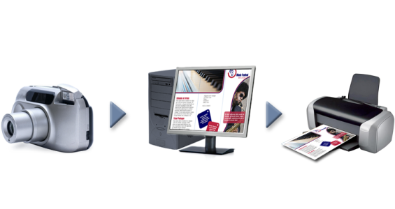
Different tools are used during the process of creating and sharing a document. For example, you may start with a file that was created in another application or import an image that was captured by a digital camera or scanner. After completing the document, you may print it or email it to a colleague for review. Each of the tools that you use in your workflow has a different way of interpreting color. In addition, each tool has its own range of available colors, called a color space, which is a set of numbers that define how each color is represented.
Example of a document workflow
In other words, when defining and interpreting color, each tool speaks a unique language. Consider a color in the color space of your digital camera: a vivid blue RGB color with the values Red = 0, Green = 0, and Blue =255. This color may appear as a different color in the color space of your monitor. In addition, the color space of your printer may not contain a match for this color. As a result, when your document moves through the workflow, this vivid blue color gets lost in the translation and is not accurately reproduced. A color management system is designed to improve the communication of color in the workflow so that the color of the output matches your intended color.
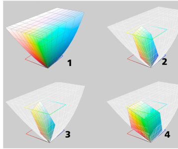
Colors are defined by their color space. 1. Lab color space. 2. sRGB color space, displayed against the Lab color space. 3. U.S. Web Coated (SWOP) v2 color space. 4. ProPhoto RGB color space.
What is color management?
Color management is a process that lets you predict and control color reproduction, regardless of the source or destination of the document. It ensures a more accurate color representation when a document is viewed, modified, shared, exported to another format, or printed.
A color management system, also known as a color engine, uses color profiles to translate the color values from one source to another. For example, it translates the colors that are displayed on the monitor into the colors that a printer can reproduce. Color profiles define the color space of monitors, scanners, digital cameras, printers, and the applications that you use to create or edit documents.
Why do I need color management?
If your document requires accurate color representation, you may want to learn more about color management. The complexity of your workflow and the ultimate destination of your documents are also important considerations. If your documents are destined only for online viewing, color management may not be as important. However, if you plan to open documents in another application or if you are creating documents for print or multiple types of output, then proper color management is essential.
Color management lets you do the following:
A color management system does not offer identical color matching, but it greatly improves color accuracy.
How do I get started with color management?
Here are some suggestions for adding color management to your workflow:
Is my monitor displaying the correct colors?
Calibrating and profiling the monitor are essential steps for ensuring color accuracy. When you calibrate a monitor, you set it to display colors according to an established standard of accuracy. After calibration, you can create a color profile of the monitor, which describes how the monitor interprets colors. This custom color profile is usually installed in your operating system by the profiling software, so it can be shared with other devices and applications. Calibration and profiling work together to achieve color accuracy: If a monitor is incorrectly calibrated, its color profile is not useful.
Calibration and profiling are complex and usually require third-party calibration devices, such as colorimeters and specialized software. Furthermore, improper calibration may do more harm than good. You can learn more about monitor calibration and custom color profiles by researching color management techniques and products. You can also refer to the documentation that was provided with your operating system or monitor.
How you perceive the color that your monitor displays is also important for managing color consistency. Your perception is influenced by the environment in which you are viewing the documents. Here are some ways to create a suitable viewing environment:
Should I assign a color profile or convert colors to a color profile?
When you assign a color profile, the color values, or numbers, in the document do not change. Instead, the application uses the color profile to interpret the document colors. However, when you convert colors to another color profile, the color values in the document change.
The best practice is to choose a suitable color space when you create a document and to use the same color profile throughout your workflow. You should avoid assigning color profiles and converting colors to other color profiles while working on a document. For more information, see Assigning color profiles and Converting colors to other color profiles.
What is a rendering intent?
A color management system can perform effective translation of document colors to multiple devices. However, when converting colors from one color space to another, a color management system may be unable to match certain colors. This translation failure occurs because some colors in the source may not fit within the range (or gamut) of the destination color space. For example, the bright red and blue colors that you see on your monitor are often outside the gamut of colors that your printer can produce. These "out-of-gamut" colors can dramatically change the look of the document, depending on how they are interpreted by the color management system. Each color management system has four methods of interpreting out-of-gamut colors and mapping them into the gamut of the destination color space. These methods are known as "rendering intents." The choice of a rendering intent depends on the graphical content of the document.
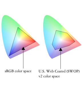
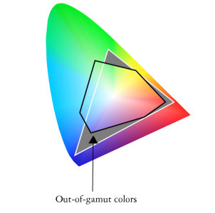
Many colors in an sRGB document may be out of gamut for the U.S. Web Coated (SWOP) v2 color space. The out-of-gamut colors are mapped into gamut according to the rendering intent.
The following rendering intents are available:
| • |
The Relative colorimetric rendering intent is suitable for logos or other graphics that contain only a few out-of-gamut colors. It matches the out-of-gamut source colors with the closest in-gamut colors at the destination. This rendering intent causes the white point to shift. If you print on white paper, the whiteness of the paper is used to reproduce the white areas of the document. Therefore, this rendering intent is a good option if your document will be printed. |
| • |
The Absolute colorimetric rendering intent is suitable for logos, or other graphics, that require very precise colors. If no match is found for the source colors, then the closest possible match is used. The Absolute colorimetric and Relative colorimetric rendering intents are similar, but the Absolute colorimetric rendering intent preserves the white point through the conversion and does not adjust for the whiteness of the paper. This rendering intent is used mainly for proofing. |
| • |
The Perceptual rendering intent is suitable for photographs and bitmaps that contain many out-of-gamut colors. The overall color appearance is preserved by changing all the colors, including the in-gamut colors, to fit within the range of colors at the destination. This rendering intent maintains the relationships between colors to produce the best results. |
| • |
The Saturation rendering intent produces more concentrated solid colors in business graphics, such as charts and graphs. Colors may be less accurate than those produced by other rendering intents. |
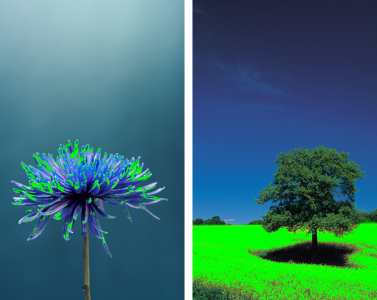
The number of out-of-gamut colors (indicated by the green overlay) may influence your choice of a rendering intent. Left: The Relative colorimetric rendering intent is suitable for this photo, which contains only a few out-of-gamut colors. Right: The Perceptual rendering intent is a good choice for this photo, which contains many out-of-gamut colors.

Not all suite components documented in this Help are available in our Trial, Academic, and OEM versions. Unavailable components may include Corel applications, product features, third-party utilities, and extra content files.
Copyright 2018 Corel Corporation. All rights reserved.