Quick links to procedures on this page:
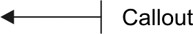
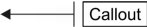
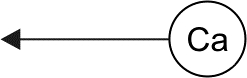
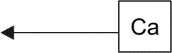
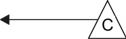
Callouts are lines with text that point to and identify objects in a drawing. You can choose from a variety of line ends, including arrowheads and other styles. Callouts can have one, two, or three line segments, or "legs," between the line end and the text.
You can use different shapes for the callout text within a drawing.
You can enhance callouts in several ways. For instance, you can change the line width and color, and you can adjust the gap between the line and the text.
The default option for callout text lets you type text after drawing the callout. You can also insert text from the Clipboard or from object properties, or you can add a value and increase it in increments as you add more callouts. For more information about object properties, see Managing and tracking projects.
You can link a callout to its source object by snapping the callout arrowhead to a snap point. Linked callouts, also known as "sticky callouts," are attached to the source objects similarly to connector lines. When you move the source object, the linked callout moves with it. You can specify how linked callouts move with the object. One option is to adjust the length of the leader line, leaving the callout text in place. The other option is to move both the leader line and callout text, preserving the appearance of the callout group. You can break the link between a callout and its source object at any time.
You can also add a halo behind the callout. A halo is a mask behind the leader line and text that makes the callout easier to see when it is on top of another object. Usually, the halo is the same color as the page, although you can choose any color you like.
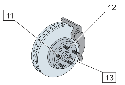
White halos are applied to the callouts to make them stand out against the underlying objects.
Callouts are added as linked groups. You can break the callout apart if necessary.
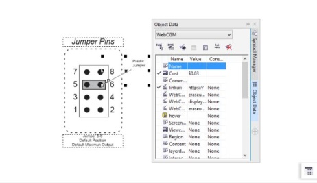
If your drawings are used in interactive electronic technical manuals (IETMs), you can make those files even more information-rich. Corel DESIGNER lets you manually add hotspots to a callout shape when outputting a drawing to a CGM v4 file, making them responsive when clicked or hovered over. Working in the Object data manager docker, you can link a callout shape to a web page, jump to a section in another file specific to the callout shape, or display a screentip. For example, you can link a part in a design to an online parts catalog, allowing for instant access to specific, up-to-date information, such as price and availability.
You can change the default properties of callouts, such as callout style, callout gap, and halo justification, from the Object styles docker (Window  Object styles). For more information, see To edit default object properties.
You can add hotspots to callout shapes.
|
• |
 Interactive — lets you type the text at the end of the callout line Interactive — lets you type the text at the end of the callout line |
|
• |
 Clipboard — pastes text from the Clipboard to the callout Clipboard — pastes text from the Clipboard to the callout |
|
• |
 Increment — adds a numeric value to the callout. The value is increased in increments as you continue to add callouts, and you can specify the start value and the increment amount. The increment values that you set apply only to the active drawing. Increment — adds a numeric value to the callout. The value is increased in increments as you continue to add callouts, and you can specify the start value and the increment amount. The increment values that you set apply only to the active drawing. |
If properties are associated with an object, you can show them in callouts.
| 2 . |
Click the Link callout button  on the property bar, and choose one of the following options: on the property bar, and choose one of the following options: |
|
• |
Change leader line — adjusts the length of the leader line, leaving the callout text in place |

Links between callouts and objects are not maintained when a drawing is saved to Corel DESIGNER X5 or earlier version.

To break the link between the callout and the object, click the Link callout button on the property bar, and choose Break callout link. You can also right-click the callout and choose Break callout link from the context menu.
| 4 . |
In the Callout data dialog box, enable any of the following check boxes: |
|
• |
Keep updated — automatically updates the callout text when the object data is modified. This option is available only for linked callouts. |
|
• |
Apply as default — sets the current settings in the dialog box as the defaults for new callouts. The dialog box will not be shown when you draw other callouts that include object data. |
You can change how object data is displayed in a callout by clicking the Callout object data button  on the property bar and modifying the settings you want.
| 2 . |
Click the Halo properties button  on the property bar. on the property bar. |
|
• |
Width — lets you specify the width of the halo on each side of the line |
|
• |
Color — lets you access a color palette to change the color of the halo, or use the color of the page |
|
• |
Opacity — lets you control the transparency of the halo and the visibility of objects underneath the halo by specifying a percentage value (with values less than 100 allowing visibility) |
|
• |
Justification — lets you specify the position of the halo in relation to the callout line |
To remove a halo from a callout, select the callout, click the Halo properties button, and disable the Halo options check box.
| 2 . |
Click Window Object data manager. |
| 3 . |
Choose WebCGM from the list box. |
For more information about applying CGM data to objects, see Applying CGM data to objects.
Copyright 2018 Corel Corporation. All rights reserved.


 Object property — adds an object property that you choose, such as the object name, to the callout. For more information, see To draw a callout that shows object properties.
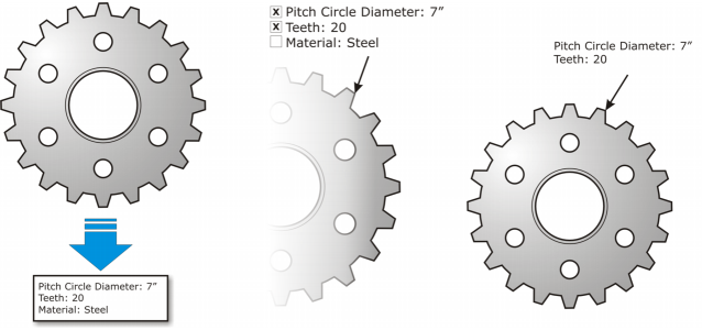
 , select a callout.